GROWTH MARKETING AGENCY
Rebrand and visual system
Digital Creative Direction

NOMADE is a growth marketing agency supporting mid-size businesses in expanding their digital presence across organic and paid media. Their approach combines automation, creative systems, and AI-driven processes to accelerate scalable growth.
INSIGHT & STRATEGY
Mid-size companies often struggle to translate growth ambitions into consistent digital presence. This creates an opportunity for NOMADE to position itself as both guide and enabler.
The strategy focused on communicating adaptability and clarity. NOMADE’s brand needed to reflect movement, experimentation, and structured growth—balancing creative exploration with performance-driven results. The identity was built to signal agility while maintaining professional credibility.
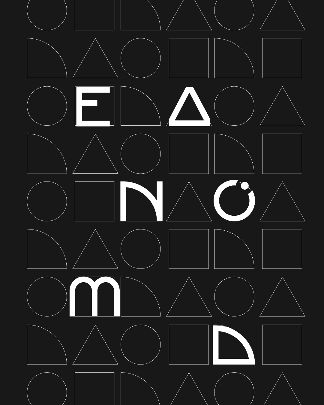
CONCEPT
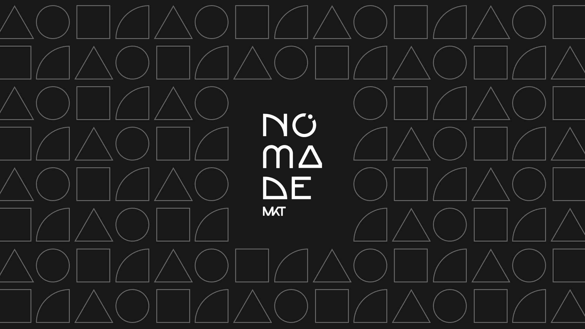
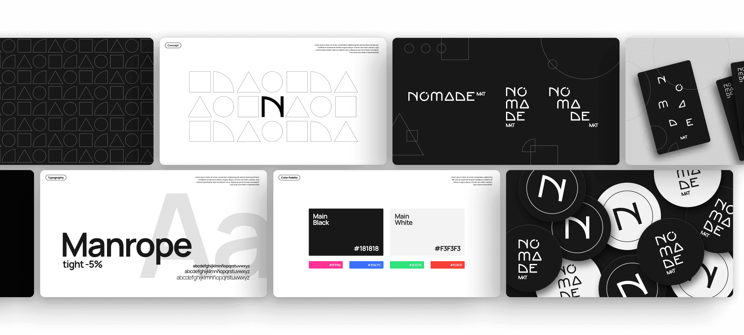
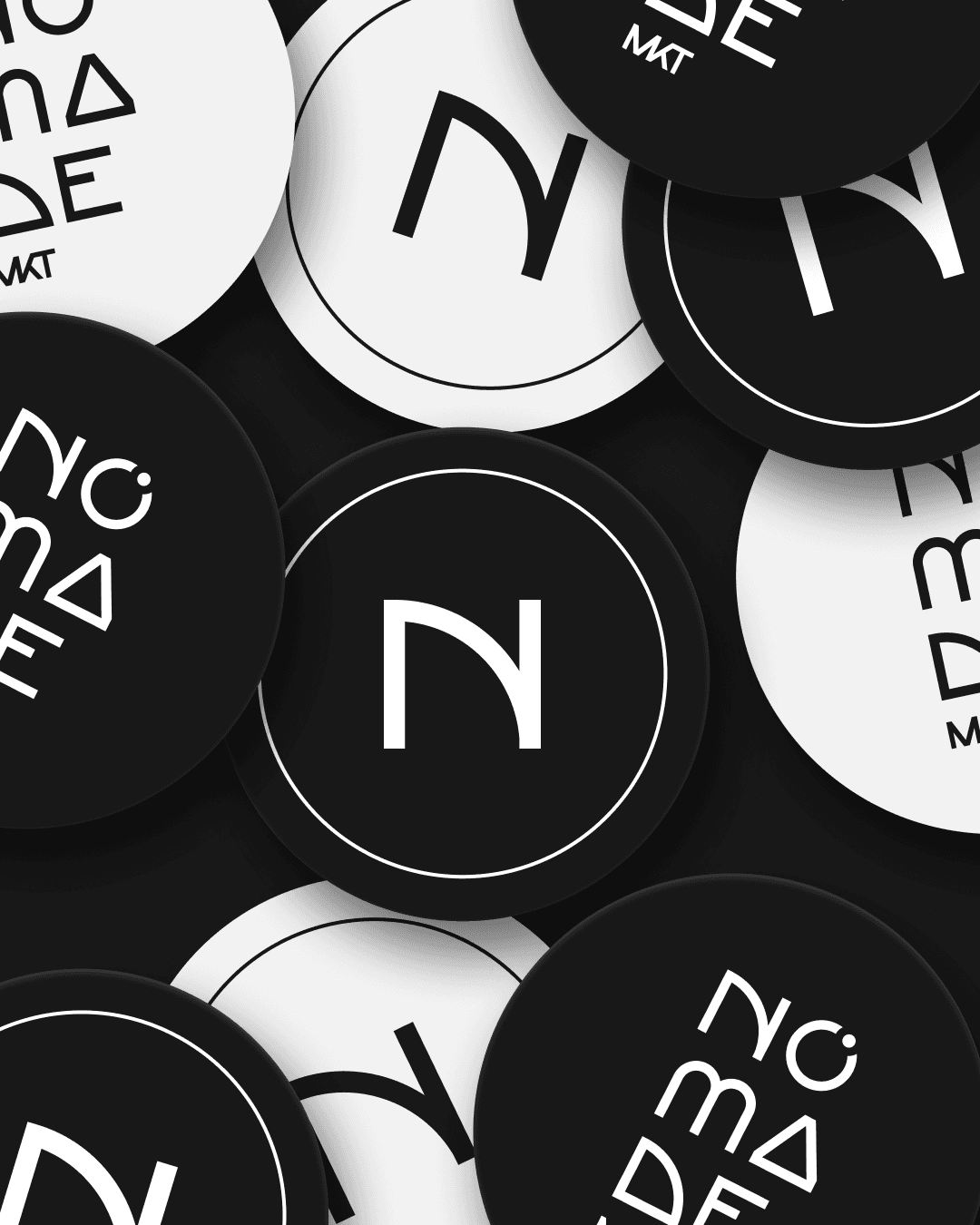
The concept draws from the idea of the “nomad” as a symbol of movement, discovery, and adaptability. Geometric forms represent modular paths and evolving strategies, mirroring how NOMADE navigates multiple channels and business contexts.
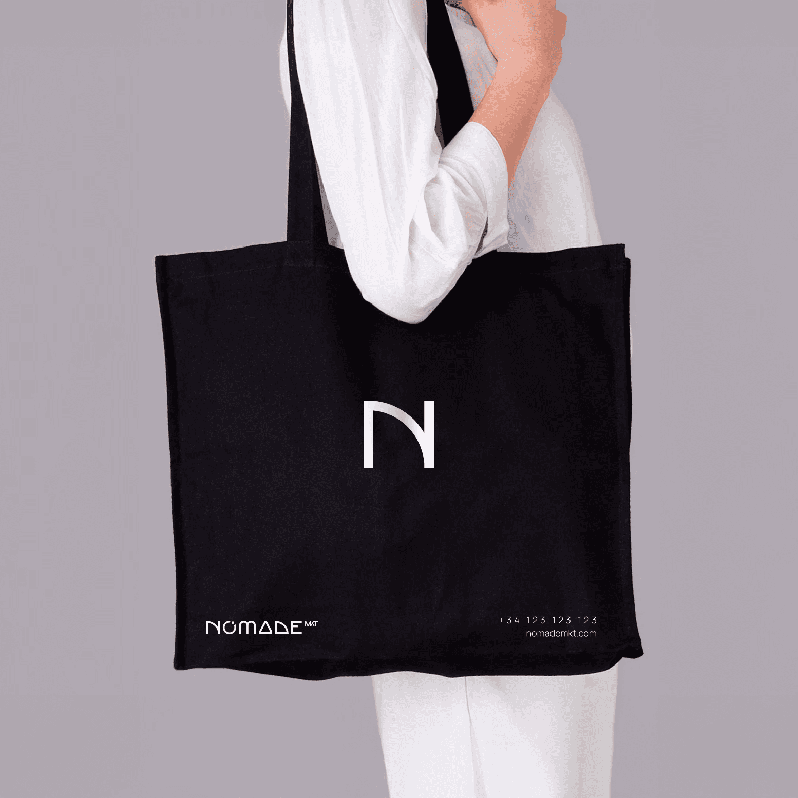
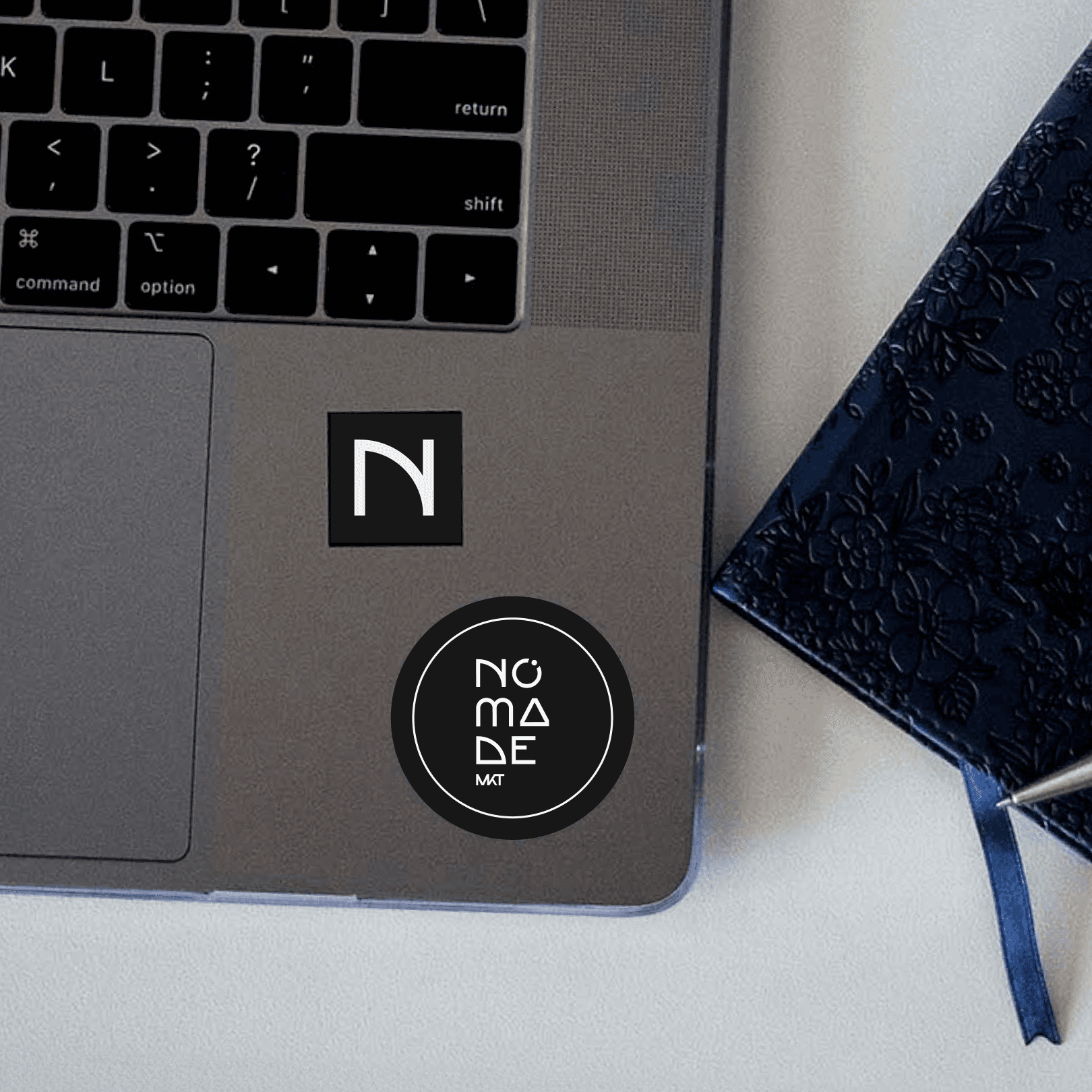
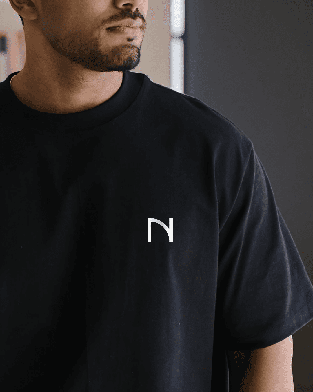
Visually, the identity emphasizes minimalism and spatial rhythm. The fragmented letterforms and geometric compositions create a dynamic system that feels digital, experimental, and scalable—supporting NOMADE’s positioning as a modern growth partner.
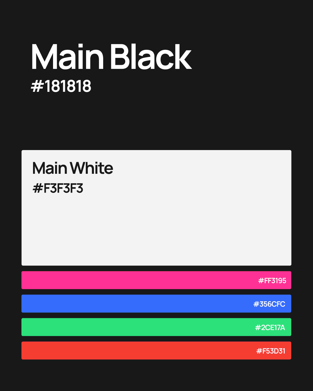
COLOR PALLETE
The palette centers on deep black and soft white to communicate clarity, precision, and sophistication. Accent colors introduce energy and flexibility, enabling the brand to adapt across campaigns while maintaining a cohesive visual foundation.
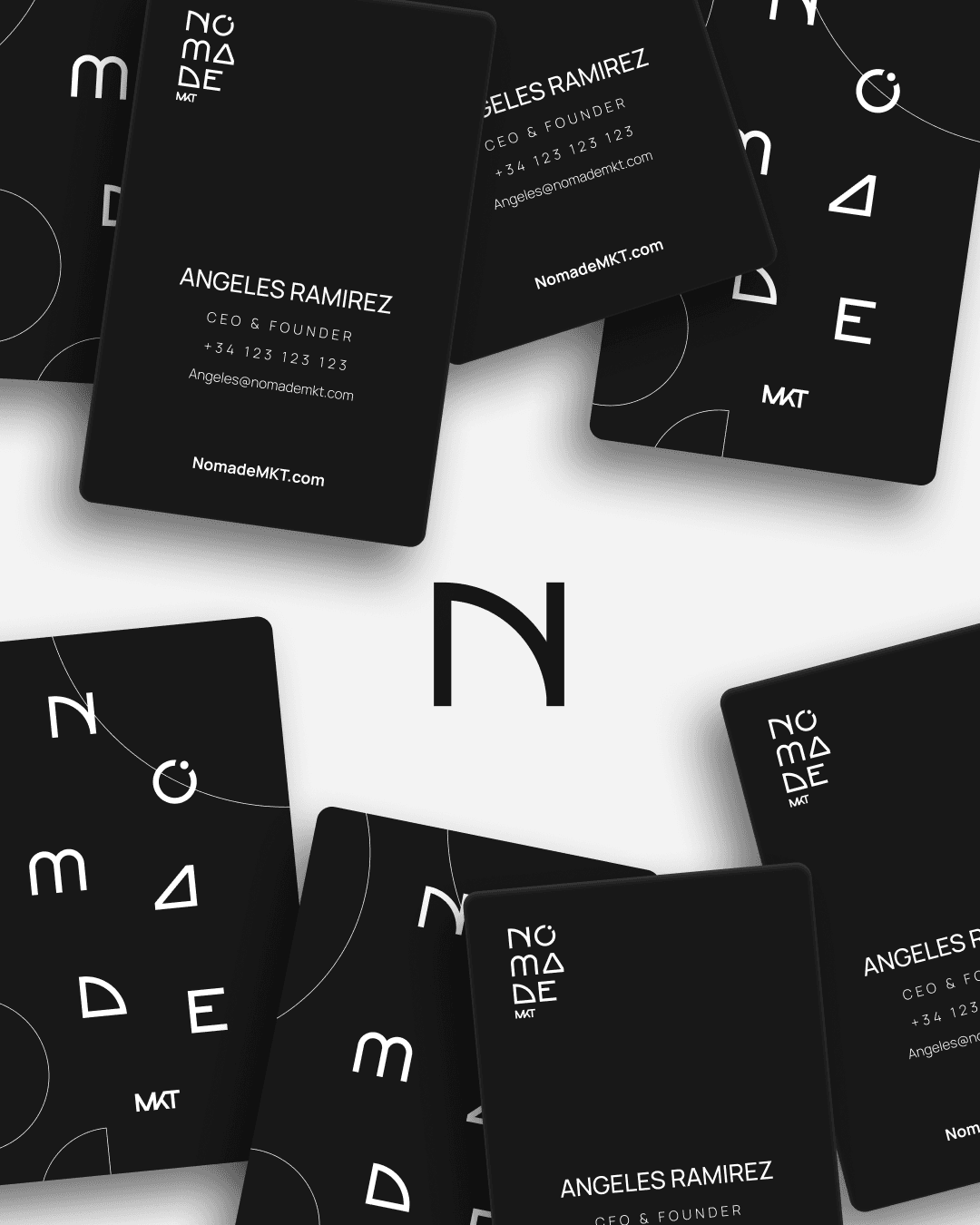
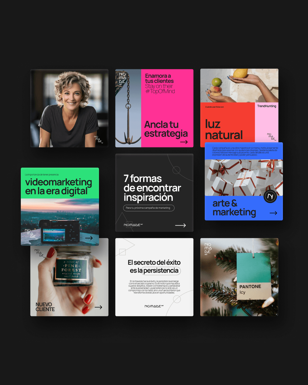
THE VISUAL SYSTEM
The visual system is built on modular geometric shapes that function as containers, patterns, and motion elements. This flexible toolkit allows NOMADE to create consistent yet diverse compositions across social media, paid ads, and brand touchpoints.
CONCLUSION
NOMADE’s identity positions the agency as a strategic navigator for growth-focused businesses. By combining a flexible visual language with a clear conceptual foundation, the brand supports scalable communication while reinforcing NOMADE’s role as a modern digital partner.