IMMIGRATION LAW FIRM
Rebrand and visual strategy.
Digital Creative Direction

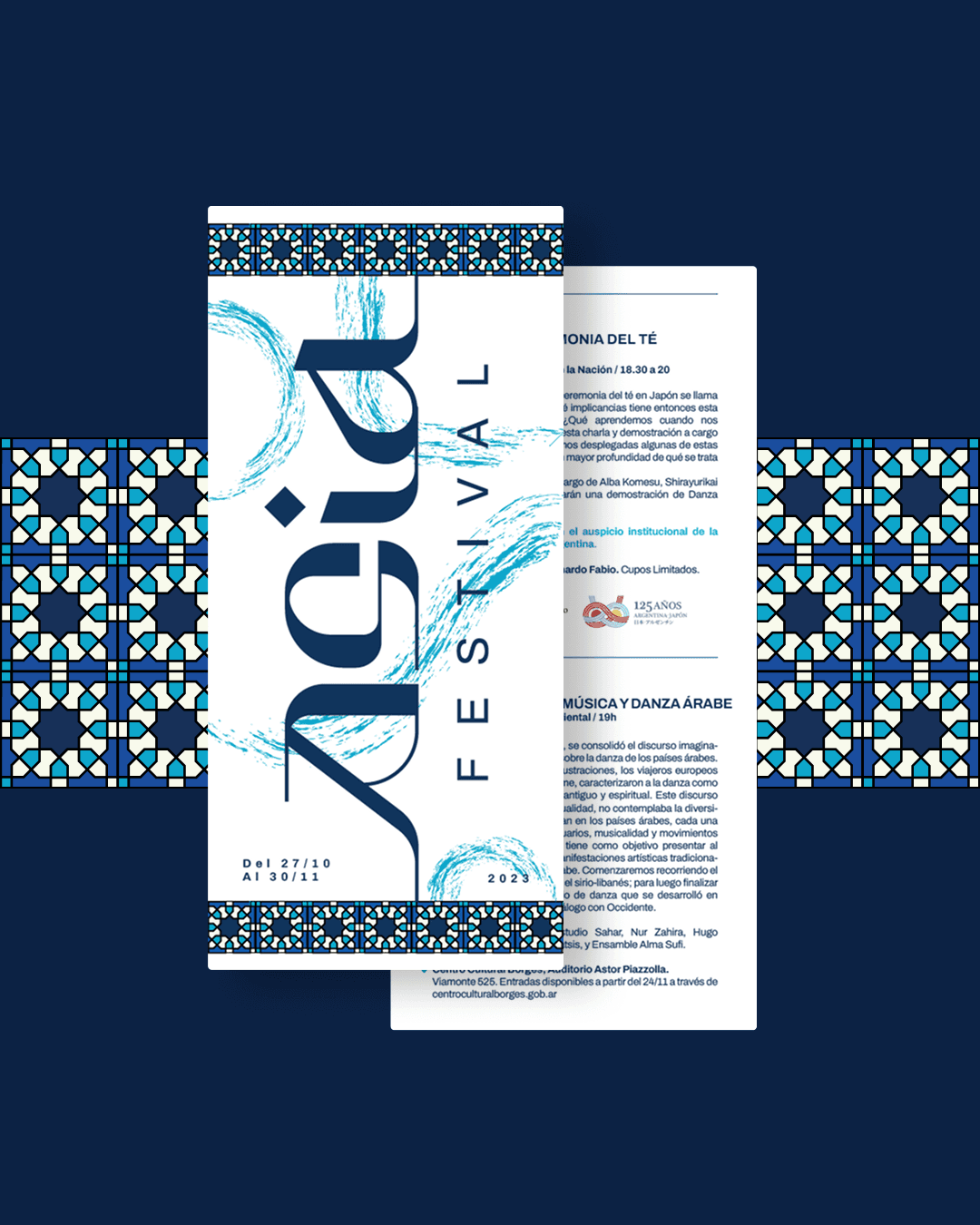
Asia Festival is an Argentinian cultural event that showcases music and dance from Asia and North Africa.
Born of Estudio Sahar, the festival aims to bring audiences closer to these cultures through performances, workshops, and immersive experiences.

INSIGHT & STRATEGY
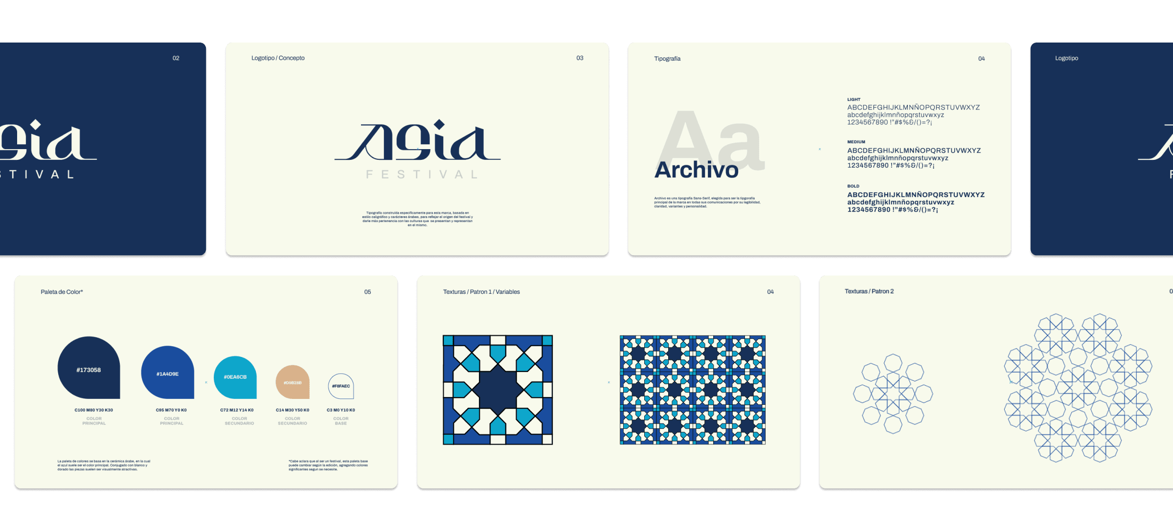
Cultural representation is not about replication — it’s about interpretation. Instead of relying on literal or stereotypical visuals, the identity draws from underlying structures found across these cultures: geometry, rhythm, and ornament.
The strategy focused on creating a visual language that feels authentic and respectful, while still contemporary and cohesive.

CONCEPT
The identity is built through a custom logotype and a modular graphic system inspired by traditional patterns and calligraphic forms. The typography becomes a central expressive element, balancing elegance with a sense of movement and cultural depth.
Geometric compositions and repeating patterns extend the identity, creating a system that reflects both diversity and unity. Each element works together to evoke a shared visual rhythm — one that connects different cultures through structure rather than surface.
COLOR PALLETE
A deep blue anchors the identity, bringing a sense of sophistication and consistency.
It is complemented by soft neutrals and vibrant accents inspired by traditional materials and textiles, allowing the system to feel both rich and balanced.


THE VISUAL SYSTEM
The system expands through patterns, layouts, and compositions derived from geometric principles.
These elements create a flexible yet recognizable framework across applications: from posters and social media to event materials.
The result is a visual language that feels immersive and dynamic, capable of representing a wide range of cultural expressions while remaining unified.


CONCLUSION
Asia Festival’s identity captures the essence of cultural diversity through structure, rhythm, and form.
By focusing on interpretation rather than imitation, the brand creates a respectful and contemporary representation of multiple traditions.
A system that doesn’t just showcase culture, but connects it.